


Observation Dashboard
The Observation dashboard is the primary interface for monitoring AI agent activity in production. It provides a consolidated view of conversation quality, volume, and risk across a configurable time window, combining high-level KPI widgets with a filterable conversation table that links directly to individual session reviews.
Accessing the Dashboard
Navigate to:
AI Data Fusion > Observation
The dashboard loads with the Last 7 Days time window selected by default.
Dashboard Layout
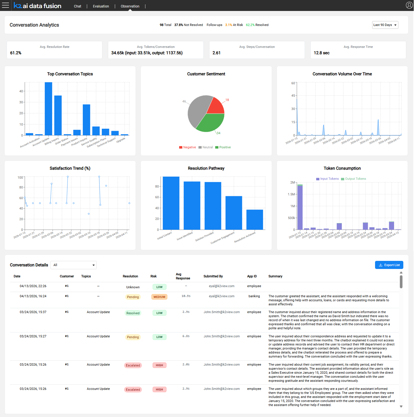
The dashboard is organized in four areas, top to bottom:
- Header bar - page title, inline summary stats for the selected period, and the duration filter
- Info cards - four KPI cards showing averages for the selected period
- Chart widgets - charts covering topics, sentiment, volume, satisfaction, resolution, and cost. This is the default widgets, which can be changed, replaced, reorganized, as well as extended, per needs
- Conversation table - a filterable list of individual sessions with a summary per row
Header Bar
The header bar displays the title Conversation Analytics alongside a set of inline summary indicators that give an immediate at-a-glance view of the selected period:
- Total - total number of conversations
- Not Resolved % - percentage of conversations tagged as not resolved
- Follow-ups - count of conversations requiring follow-up
- At Risk % - percentage of conversations flagged as at risk
- Resolved % - percentage of conversations tagged as resolved
The duration filter is on the right side of the header bar.
Duration Filter
The duration filter controls the time window for all widgets and the conversation table simultaneously.
Changing the duration refreshes all widgets and the conversation table without reloading the page.
Info Card Widgets
Four info cards are displayed side by side, each showing an average for the selected period:
- Avg. Resolution Rate - percentage of conversations that reached a resolved state
- Avg. Tokens / Conversation - mean total tokens per session, with an input/output breakdown shown below the main figure
- Avg. Steps / Conversation - mean number of agent execution steps per session; indicates conversation complexity
- Avg. Response Time - mean end-to-end response time per turn, in seconds
Each card's query is configurable. See Configuring Observation for how to add or modify widgets.
Chart Widgets
Chart widgets are displayed in a 2 or 3 grid (depending on width and screen resolution), covering the key dimensions of conversation quality and cost.
Below are the default widgets:
Top Conversation Topics - Bar chart ranking topics by session count. Reveals which subjects drive the most volume (e.g., Billing Inquiry, Account Update, Technical Support).
Customer Sentiment - Pie chart showing the split between Positive, Neutral, and Negative conversations. Gives an immediate read on overall customer experience.
Conversation Volume Over Time - Line chart of daily session count. Highlights traffic patterns, spikes after deployments, and quiet periods.
Satisfaction Trend (%) - Line chart of satisfaction percentage over time. Use this to track whether quality is improving or declining following agent changes.
Resolution Pathway - Bar chart showing how far conversations progress through the resolution stages (Initial Contact → Issue Identified → Solution Provided → Customer Engagement → Resolution Achieved). Identifies where conversations tend to drop off.
Token Consumption - Bar chart of input, cache and output token usage over time. Use for cost tracking and detecting unusual consumption spikes.
All widgets are configurable. See Configuring Observation for how to add, modify, or replace widgets.
Conversation Table
The Conversation Details table lists individual sessions for the selected period. A filter dropdown above the table narrows the list by conversation type.
Columns
Filter Modes
Exporting Data
Click the Export List button above the conversation table to download the current view (respecting the active duration and filter) as a file. Use this for reporting, sharing with stakeholders, or loading into external analytics tools.
Navigating to Conversation Review
Click any row in the conversation table to open the Conversation Review page for that session. The review page shows the full message history, auto-tags, user feedback, and execution trace.
Next article: Conversation Review
Observation Dashboard
The Observation dashboard is the primary interface for monitoring AI agent activity in production. It provides a consolidated view of conversation quality, volume, and risk across a configurable time window, combining high-level KPI widgets with a filterable conversation table that links directly to individual session reviews.
Accessing the Dashboard
Navigate to:
AI Data Fusion > Observation
The dashboard loads with the Last 7 Days time window selected by default.
Dashboard Layout
The dashboard is organized in four areas, top to bottom:
- Header bar - page title, inline summary stats for the selected period, and the duration filter
- Info cards - four KPI cards showing averages for the selected period
- Chart widgets - charts covering topics, sentiment, volume, satisfaction, resolution, and cost. This is the default widgets, which can be changed, replaced, reorganized, as well as extended, per needs
- Conversation table - a filterable list of individual sessions with a summary per row
Header Bar
The header bar displays the title Conversation Analytics alongside a set of inline summary indicators that give an immediate at-a-glance view of the selected period:
- Total - total number of conversations
- Not Resolved % - percentage of conversations tagged as not resolved
- Follow-ups - count of conversations requiring follow-up
- At Risk % - percentage of conversations flagged as at risk
- Resolved % - percentage of conversations tagged as resolved
The duration filter is on the right side of the header bar.
Duration Filter
The duration filter controls the time window for all widgets and the conversation table simultaneously.
Changing the duration refreshes all widgets and the conversation table without reloading the page.
Info Card Widgets
Four info cards are displayed side by side, each showing an average for the selected period:
- Avg. Resolution Rate - percentage of conversations that reached a resolved state
- Avg. Tokens / Conversation - mean total tokens per session, with an input/output breakdown shown below the main figure
- Avg. Steps / Conversation - mean number of agent execution steps per session; indicates conversation complexity
- Avg. Response Time - mean end-to-end response time per turn, in seconds
Each card's query is configurable. See Configuring Observation for how to add or modify widgets.
Chart Widgets
Chart widgets are displayed in a 2 or 3 grid (depending on width and screen resolution), covering the key dimensions of conversation quality and cost.
Below are the default widgets:
Top Conversation Topics - Bar chart ranking topics by session count. Reveals which subjects drive the most volume (e.g., Billing Inquiry, Account Update, Technical Support).
Customer Sentiment - Pie chart showing the split between Positive, Neutral, and Negative conversations. Gives an immediate read on overall customer experience.
Conversation Volume Over Time - Line chart of daily session count. Highlights traffic patterns, spikes after deployments, and quiet periods.
Satisfaction Trend (%) - Line chart of satisfaction percentage over time. Use this to track whether quality is improving or declining following agent changes.
Resolution Pathway - Bar chart showing how far conversations progress through the resolution stages (Initial Contact → Issue Identified → Solution Provided → Customer Engagement → Resolution Achieved). Identifies where conversations tend to drop off.
Token Consumption - Bar chart of input, cache and output token usage over time. Use for cost tracking and detecting unusual consumption spikes.
All widgets are configurable. See Configuring Observation for how to add, modify, or replace widgets.
Conversation Table
The Conversation Details table lists individual sessions for the selected period. A filter dropdown above the table narrows the list by conversation type.
Columns
Filter Modes
Exporting Data
Click the Export List button above the conversation table to download the current view (respecting the active duration and filter) as a file. Use this for reporting, sharing with stakeholders, or loading into external analytics tools.
Navigating to Conversation Review
Click any row in the conversation table to open the Conversation Review page for that session. The review page shows the full message history, auto-tags, user feedback, and execution trace.
Next article: Conversation Review
